
We all know the feeling, searching through our wardrobe for the right outfit to wear. Is it too formal, too loud, too casual? Finally, we make a choice, get dressed for the day and (with luck!) sally forth with confidence, knowing that our clothing choices reflect us and our tasks for that day.
So it is with the presentation for our businesses. The choice of styling and the usage of fonts on our website and in our written material say a lot about us and our personalities.
Many of us pick a font as though we are searching for a piece of clothing. We assess the personality of each font and look for something unique and distinctive that expresses our particular taste or perspective. However, others have been there before us and there are already many tried and tested fonts that have become established workhorses. To continue the analogy, they are like your most comfortable jeans, ready to go with everything else in the wardrobe.
These fonts seem to adapt to their surroundings and become more relaxed or more formal as the occasion calls for, and they just seem to come out of the wardrobe day after day. Usually, these are faces that have a number of weights (Light, Regular, Bold, etc) and/or cuts (Italic, Condensed, etc). My particular safety blankets are Calibri, Gotham, Trebuchet and Myriad
The clothing analogy gives us a good idea of what kind of wardrobe we need to put together. The next challenge is to develop some kind of structure by which we can mentally categorize the different typefaces we run across. Typefaces can be divided and subdivided into dozens of categories. But mainly they fall into two categories. Serifs or San serifs – The serifs being the little feet or strokes at the ends of the letterforms.

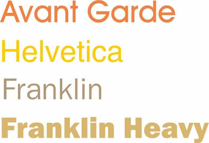
Within the San Serifs we find the strict geometric forms. The individual letter forms of a Geometric Sans often have strokes that are all the same width and frequently evidence a kind of “less is more” minimalism in their design. At their best, Geometric Sans are clear, objective, modern, universal; at their worst, cold, impersonal and boring.
Examples include Helvetica, Avant Garde and Franklin
Slightly softer looking sans styles are derived from handwriting and include Verdana and Gill Sans. The letter forms of these fonts generally have more detail, less consistency, and frequently involve thinner and thicker stoke weights.
Serif Fonts mimic older style typefaces and are the result of the development of calligraphic forms. The caligraphic tails impart a traditional look to the piece of work. Old Style faces at their best are classic, traditional, readable and at their worst are… well, classic and traditional.
Examples include Palatino, and Garamond
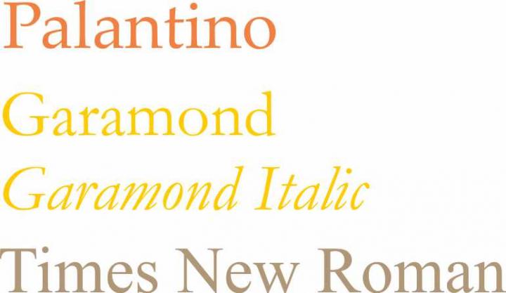
Some more modern fonts have blurred the lines between the two styles, their letterforms more geometric, sharp and virtuosic than the unassuming faces of the Old Style period. An example is Bodoni. They can be strong, stylish, dynamic but they may also be too classic too stodgy to be truly modern. Times New Roman being a case in point.
So, now that we know our families and some classic examples of each, we need to decide how to mix and match and — most importantly — whether to mix and match at all. Most of the time, one typeface will do, especially if it’s one of our workhorses with many different weights that work together. If we reach a point where we want to add a second face to the mix, it’s always good to observe this simple rule: keep it exactly the same, or change it a lot — avoid wimpy, incremental variations.
Unfortunately, it’s not as simple as just picking fonts that are very, very different, but if we want some principle to guide our selection, it should be this: often, two typefaces work well together if they have one thing in common but are otherwise greatly different. This shared common aspect can be visual (similar x-height or stroke weight) or it can be chronological.
Time for another clothing analogy: My outfit works because my green belt acts as an accent and is offset by the down-to-earthiness of my jeans. But if I get carried away and cover myself in Telefonica green then it may not look so attractive.
Use display faces with lots of personality in small doses. If we apply our cool display type to every bit of text in our design, the aesthetic appeal of the type is quickly spent and — worse yet — our design becomes very hard to read.
Take some time to experiment with fonts. It’s fun to play and there are no hard and fast rules – but always ensure legibility, use white space (that’s another whole blog in itself) play with the format (text heights widths, spacing and kerning and leading) and when you have a got a great looking piece of text PROOF IT. Nothing is worse than poor use of punctuation, poor spelling and poor grammar. It’s like going out looking absolutely fabulous, but with your skirt caught up in your knickers behind you.
Lynne Armitage is a designer and has a digital print workshop on the Costa del Sol. She is a member of Costa women. www.jigsawdesign.biz
I needed this info 2 years ago when I was publishing my book… Thankyou for explaining it all so nicely… better late than never. Love Barbara x